31 Call To Action Examples And How To Write A Perfect CTA

1. Introduction
When it comes to marketing, your main goal should be generating and converting leads if you want to boost the growth and increase the revenue. In the present era, the average attention period is about 8 seconds, down from 12 seconds back in the year 2000. So, how we as marketers grab the attention of the potential audience and convert them into an actual lead.
This can be done with the help of the one small but bold tool, with this you can increase the chance of attracting and converting the ideal audience. Just enter Call to action (CTA).
2. What is a Call to action (CTA)?
Call to action buttons are the tabs that you use on your online marketing pages such as landing page, advertisement page, web page, etc, to achieve your end goal that is concerting a visitor to a prospective lead and then a customer. There are two main functions of a good CTA and that is they inform their readers as to what to do to join or subscribe and they inform their readers why they should hit that CTA button. CTA is the first thing that catches the attention of any visitor and therefore you need to be very careful with what kind of CTA you want to palace. We have compiled a list of a few Best practices in the field of CTA along with their examples.

3. 31 Call to Action Examples
1). Compelling yet sweet
Here is a screenshot that was taken from the website of the DBS website that explains the Call-to-action button of Big Ass Fans. It’s an amazing call to action example of how you can use compelling action verbs in a very sweet way to entice your audience—

2). Creative Words
Here is another wonderful call to action example used by JanBask Digital Design as it is using something out of the box to tantalize the curiosity of the visitor. It is not using words like sign-up, follow us etc. “Let us Build your brand” does it not sound tempting to hit this button? Surely it does.

3). Tickle their pockets
This is one thing that never lets you down. The moment you offer something free to anyone it is very likely that people will definitely sign up for it. Here is CTA example taken from Netflix wherein it is tempting the users to sign up by offering a free one-month subscription.

4). Make Use Of First Person Pronoun
Users cherish seeing CTAs that welcome them to buttons like to “Show Me More” and “Show Me How.” It reminds the client that they are receiving an advantage as well. Numerous Non-profit and cause-based associations have seen awesome outcomes from CTAs like “I agree,” in light of the fact that they urge the client to adjust their qualities or objectives to the association.
Here is a screenshot taken from wishpond explaining the above philosophy – the button says “Build My Page” which gives a good personalized approach.

5). Include words like finding out first
Many of your customers or users wish to know about anything new at the earliest opportunity to stay up to date and that is the bait you can use to lure them. Here is an example of Rothy’s website

6). Align the color of CTA with that of Headline
Here is an cta examples of Evernote that is using a very simple CTA ie Sign up but it is attractive due to its good color combination and matching with the headline

7). Personalization
This is one technique that always works, add your client’s name to your CTA and make him feel valued. This is an age-old practice in marketing and has seen great success. Let us review the CTA examples screenshot taken from DropBox-

8). Work on the Complete View
Providing a good CTA is not enough, you need to be very careful about its entire view i.e. surrounding graphics; text font etc. Here is areally good CTA examples taken from the website of Square.

9). Be Short And Precise
Salesforce has definitely set a very good example for this. Their call to action button and the sign-up page are to the point no extra things required which in turn makes the user very happy by not typing or going through hassles.

10). Place the CTA at highest visible point
The intention behind the CTA is to draw in visitors and transform them into leads; hence, you’ll need to put a CTA in an area on your site that sees a lot of new guests, such as your blog. The best places you could put a CTA are towards the end of a post, in the sidebar, and as a gliding pennant in the corner. Here is a screenshot that was taken from the website of Hubspot explaining the same-

11). Power of Social Media
You can use social media sharing buttons as they are a very good way of lead generation. It is an easy way for the visitors to be in touch with your company and you can even put up buttons to log in via Facebook, Instagram etc. Here is a screenshot explaining the same

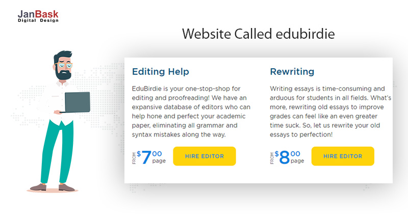
12). Add figures
Many visitors think in terms of numbers. They love to see how much time they are saving or money which they would save. They are driven by stats. Try to include that. Here is a screenshot was taken from a website called edubirdie-
13). Use Words Related To Your Website
Here is an example of a website that works in the area of saving cats around the world. To target the like minded people see what they have used in their CTA, they have used the term “Join the pride today”

14). Give A Jibe To The Creative Mind
Here is another good example that seems very compelling for a visitor to definitely hit your CTA. This is the CTA OF Huemor and it looks really cool!

15). Highlight the benefits that customer gets
Lure your customer by placing the best points about your organization. This will definitely provoke him to hit your CTA, here is an call to action example of Thrive Market’s -
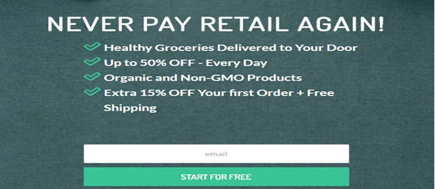
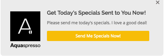
16). Harness The Psychological Tactic Of Scarcity
People love exclusiveness. And in this example that we will see of the CTA of Aquaspresso we will see how they have smartly bartered the email address of their customer with giving them info on specials.
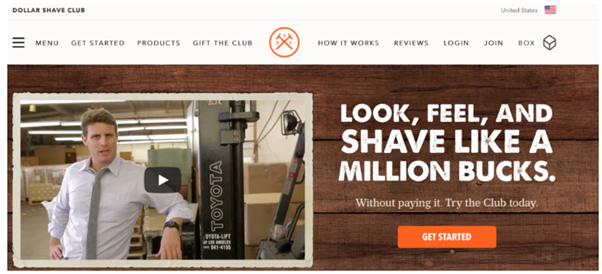
17). Be a little less committal
Here is an example of Dollar Shave Club and in their CTA they use the word try instead of join which is a little less committal as you can leave if not satisfied with the trial.
18). Put your visitor in a dilemma
At times it is good for your business to fill the mind of the visitor with doubt. Trust me no one wants to be wrong. Give them a CTA that then helps them clear that doubt. Here is a great call to action example of QuickSprout.

19). Loud and Clear Message
One another great way is to have your entire message condensed in two or three pointers wherein your visitor knows what he will get in just a few seconds. Here is an cta examples of Shakr-

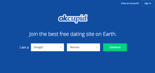
20). Keep it Short and Casual
Let’s see the CTA of OKCupid which is extremely short and casual and gives you a sense of ease-
21). Promote an Event
You can also use CTA that promotes an event so that you can spread more awareness about that event. Here is a screenshot of an example of one such CTA taken from the website of Hubspot-

22). Substitute Boring Words with Action Words
Instead of using the cliché words such as ‘sign up’ ‘take your trial’ etc use action words such as grab, take, claim etc. They give a sense of freshness to your visitor. Here is an example of Udemy explaining the same-

23). Make it Prominent
Here is an example of a good and prominent CTA on the page of Bombfell, the CTA tab is large, outstandingly displayed, and is not contrary to anything else on the page.

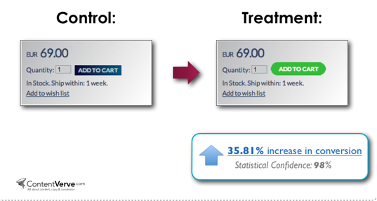
24). Go for different Button Shapes
Anything that puts you apart helps even a different shape of the button. This is because your visitor craves for novelty. Here is an example of ContentVerve wherein they have used a rounded box instead of the normal rectangle.
25). Emphasise on no risk
Here is a wonderful example of Purple which inculcates a scenario wherein the user feels at a no-risk/high-reward situation for new subscriptions-

26). Insert CTA in Your Blogs
Another good way of generating leads is through placing the CTA in your blogs section. Here is a good example of that-

27). Put Count-down Clock
Nothing gives you a chance to have more leads than creating a sense of urgency by placing a timer on the CTA button. Here is a good example of that, a screenshot taken from the website of WordPress-

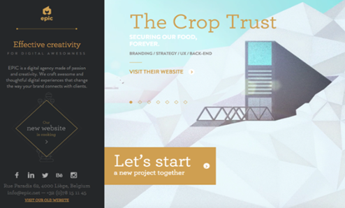
28). Friendly Language
Here is an example of the CTA of the website of EPIC, they display their work through videos and their CTA is very friendly as it says “Let’s start a new project together” this gives a sense of friendliness. Here is a screenshot-
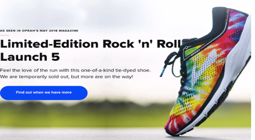
29). Make Your CTA Opportunistic
An opportunistic CTA holds more chances of getting clicked because it is human nature that they do not want to miss an opportunity. Here is a good example of Brooks Running wherein they use this CTA-
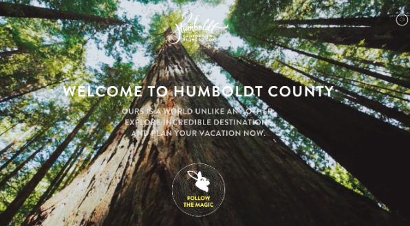
30). Try the Magic of Fantasy
People love fiction and fantasy, use a CTA that can totally arouse that part of their brain and give you a good lead. Here is a wonderful example of Humboldt County wherein their CTA says- “Follow the Magic” isn’t it fantastic?
31). Place and Balance Multiple CTAs
You can also garner the power of multiple CTAs on one page but the challenge here is that you need to be extra cautious to balance it properly. Uber is doing a wonderful job with that take a look-

4. 5 Quick Tips to create best Call to Action (CTA) Phrases
As we have taken a look at some amazing cta examples, here are 5 quick tips to create best call to action phrases.
4.1 Start your website with Strong Action Verb
Quickly tell your targeted audience exactly what you want them to do. Let’s suppose for example, if you are having an eCommerce website, you can start your CTA with words like “order”, “shop” or “buy”.
4.2 Use Strong Words
To induce strong response from your targeted audience, try to create excitement-producing cta phrases like “ Flat 50% off” or “Join to get Cashback Instantly”.
4.3 Generate a Reason to Take Action
Tell your targeted audience exactly what’s in it for them. Bind your value proposition, giving your targeted audience incentive that inspire them
4.4 Pick a Good Color for your CTA
There has been a lot of talk about psychology of color in the CTA. The fact is that you should choose your call to action button color that stands out from your competitor so that the audience knows exactly where they need to click to take action.
4.5 Test your Call to Action buttons
It is very important to keep your call to action (CTA) fresh to be effective. Continuously run A/B tests to check which call to action buttons are getting clicks and which don’t.
5. Conclusion
These call to action examples shows that having a powerful and well crafted call to action can give your website a new life.
Call to action is a huge tool available to you. If you use it correctly you can reach unfathomable heights as these are the primary steps towards your lead generation as well as the conversion rate optimization. A good CTA can take you and your business a long way as it is the first instance wherein the customer is willing to give you his information. It is the first step towards his faith in you. Be careful with what you put as your CTA.
Source Link: https://www.janbaskdigitaldesign.com/blogs/calls-to-action/


Comments
Post a Comment